feat(list): add info dialoge to show list description #2368
No reviewers
Labels
No Label
area/internal-code
changes requested
confirmed
dependencies
duplicate
good first issue
help wanted
hosting
invalid
kind/bug
kind/feature
question
wontfix
No Milestone
No project
No Assignees
4 Participants
No due date set.
Dependencies
No dependencies set.
Reference: vikunja/frontend#2368
Loading…
Reference in New Issue
No description provided.
Delete Branch "feature/list-description"
Deleting a branch is permanent. Although the deleted branch may continue to exist for a short time before it actually gets removed, it CANNOT be undone in most cases. Continue?
This PR adds an info dialoge to show the list description. I've gone for a dialoge instead of showing it directly because there's really no place next to the title to show the description.
Related Discussion:
https://community.vikunja.io/t/list-description-not-visible/459/2
https://community.vikunja.io/t/hovering-a-task-with-a-description-should-show-a-truncated-description-as-a-popup/738
Resolves #2329
Hi konrad!
Thank you for creating a PR!
I've deployed the changes of this PR on a preview environment under this URL: https://2368-feature-list-description--vikunja-frontend-preview.netlify.app
You can use this url to view the changes live and test them out.
You will need to manually connect this to an api running somehwere. The easiest to use is https://try.vikunja.io/.
Have a nice day!
Could we intead move the content down and show the description below?
If the description is expanded or collapsed could be saved as a user setting.
This way every user can decide if he wants to see the description all the time.
As an alternative we could use a tooltip. This way we don't block the interface in order to show a text that describes what lays below.
That might work, but it wouldn't look great IMHO. And it would break the layout of the kanban board because it'd push the tasks down.
Since the description can be very big and a tooltip is usually not scrollable I don't think that's a good idea.
I'm not a 100% convinced of my solution either but it was the less obstrusive one I could think of.
Looks like Trello and todoist solve this by not having a list description, Linear has a nice little project overview slide-out with all info about the project.
@ -290,2 +294,4 @@cursor: pointer;}.info-button {Remove indention
Done.
@ -73,3 +73,3 @@import {marked} from 'marked'import DOMPurify from 'dompurify'import hljs from 'highlight.js/lib/common'import {setupMarkdownRenderer} from '@/helpers/markdownRenderer'Nice!
@ -339,0 +344,4 @@meta: {showAsModal: true,},props: route => ({ listId: parseInt(route.params.listId as string) }),Picky:
We should start to use
Number()here instead (also in all the other route definitions).Reason:
We currently don't define the radix parameter and
parseInt(someVar, 10)is not as easy to read asNumber(someVar).That we start having problems with radix is very unlikely though.
Makes sense. Changed it.
@ -0,0 +28,4 @@})const store = useStore()const list = computed(() => {Picky:
Put in one line:
Done.
I had to think here of some older Jira version that I remember had this feature. Can't say if that's still possible since I haven't used it in years. In reality it was quite handy since you could link to related material, e.g. Notion, GitHub etc.
As far as I remember space wasn't an issue since you could scroll and then the description would disappear.
I was thinking of something like in Zulip or Slack, where an abbreviated description is shown next to the channel topic for quick access:
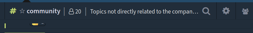
This is especially handy for links to other tools.